 |
| Final poster |
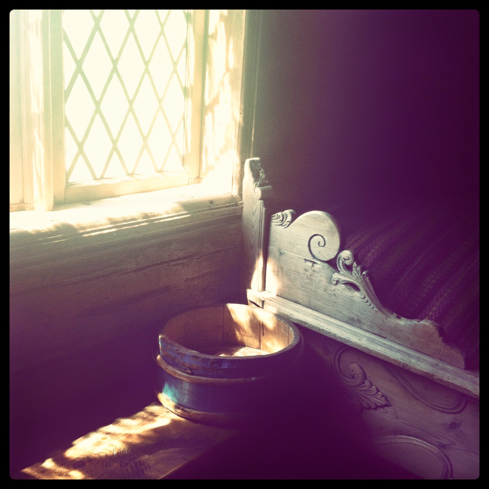
Having worked as a guide in Maihaugen, one of the largest open-air museums in Norway for many summers as a student, the words 'tradition' and 'Norwegian' always conjure up images of stylised acanthus wood carvings. The acanthus is a Mediterranean plant used extensively in Norwegian folk art from the 1700s and onwards, especially in the eastern part of the country. Here's a photo I took in Maihaugen of a bed decorated with the acanthus motif:
I decided the main decoration would be a simple acanthus shape to tie in with the traditional Norwegian music in the choir repertoire. To give it an elegant look, I wanted to hint at old-fashioned type-setting, using an Old Style typeface with a combination of small caps, ligatures, and italics in various sizes. I also stuck to just two colours: Dusty pink (which apparently is the English translation for Norwegian Gammelrosa, one of the cheaper colours for paint a few hundred years ago) for femininity and Romanticism, and dark chocolate for elegance and style.
Background and motifs: Photoshop
The very first thing was to create the acanthus decorations. I did this by tracing some images of wood carvings of the plant with the Pen Tool in Photoshop, creating Shape Layers. This ensured that they stayed crisp and sharp even after adjusting their shape and size later on. Here is one of the motifs in the making (pink (colour code #efcbcf) layered on top of photo):
 |
| Photo used for tracing: Bob Easton, in turn inspired by these. |
I traced every part of the design, creating nine individual pieces of leaf and stem (not individually visible yet):
 |
| Photo used for tracing: Bob Easton, in turn inspired by these. |
I made another set from a different source of inspiration. In Photoshop, I first created an A2-sized document (including a 3mm bleed) and filled it with pink. Then, the various shapes I had created were dragged into place. I sometimes took elements from one (easy when they consist of different Shape Layers) and combined it with another, creating even more different motifs. Finally, a 10px Stroke of dark chocolate (#17140f (sounds delicious)) was added to create the actual 'drawings,' along with a rectangular box for the name of the choir:
 |
| Originally, I designed this with the colours reversed, but it was found too dark. |
Lettering: InDesign
I then imported the background into InDesign for the lettering. For 'Multa Paucis' I chose Perpetua, a lovely Transitional typeface designed by well-known designer Eric Gill. I chose it partly because of its distinctive capital U, which has a shoulder with serif:
The rest of the text was set in Garamond Premier Pro, a typeface with a long history and one of the most readable typefaces for print. I set it between horizontal lines with very generous margins (following the margins from the name at the top).
The Premier Pro version has quite a lot of alternative versions of many of the letters, accessible in InDesign through the Glyphs menu. Note, for instance, the more elaborate versions that I picked for many of the final letters and also the st ligature in 'student:'
I usually design posters based on one or more photographs, so creating one with limited colours and mainly text was a very interesting experience.
If you are in Bergen, you can still catch the concert (14 May). The conductor sent me a soundbite and they sound lovely!


I have read all the comments and suggestions posted by the visitors for this article are very fine,We will wait for your next article so only.Thanks! fotokunst
ReplyDeleteThanks for taking the time to discuss this, I feel strongly about it and love learning more on this topic. If possible, as you gain expertise, would you mind updating your blog with extra information? It is extremely helpful for me. poster filters
ReplyDelete