 |
| Photo: Lasse Tomren, make-up: Jessica Ådland, model: Anna L. B. Malo. |
Last year, I made a cover for JKD & the Bastards' new single 'Jeg vil vekk.' The song revolves around a young girl who, after leaving her homeland for Norway, ends up as a prostitute. To reflect this, they wanted a cracked, porcelain-like face of a girl on the cover. Here is how I created it.
The image was shot in RAW, which allowed me to make the skin look as pale as possible right from the start using Photoshop's Camera RAW plug in.
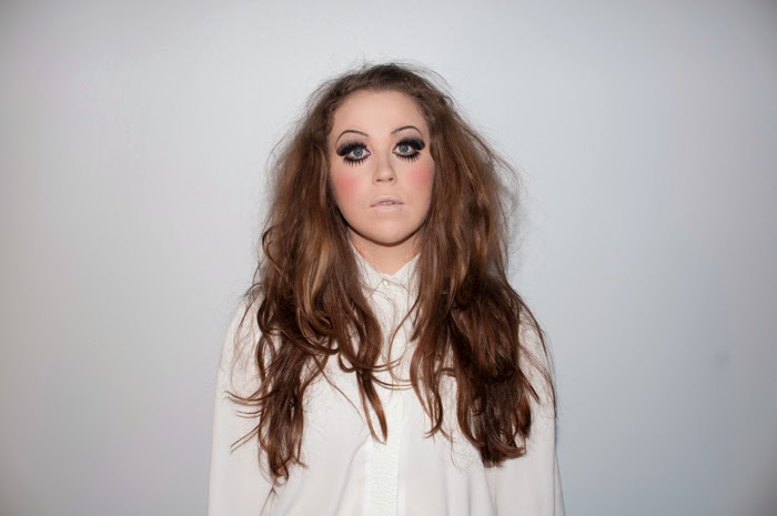 |
| Original image. |
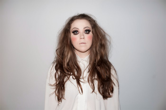 |
| After adjustments in Camera RAW. |
Make-up had provided a good foundation by among other things adding fake (higher) eyebrows and lashes set further away from the eyes. This give a wide-eyed, doll-like look.
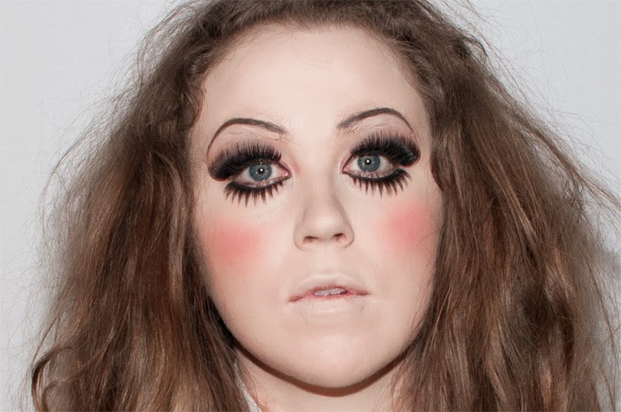 |
| Close-up of make-up. |
I first smoothed out the skin by copying the image and giving it a High Pass filter set to Overlay. A High Pass filter identifies details in an image and, depending on your setting, can either sharpen or unsharpen details. In this case we needed a porcelain-like skin, so the filter was used to smooth out the texture of the skin. To blend this with the underlying image, the layer blending mode was set to Overlay, which darkens dark areas, brightens bright areas, and fades out mid tones. The eyes and teeth were brightened to make them stand out more and give them a more artificial appearance.
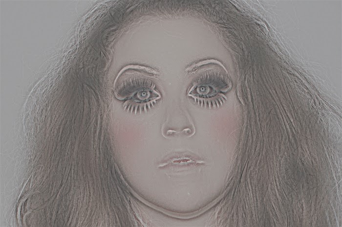 |
| High Pass filter. |
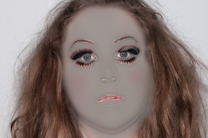 |
| Keeping only areas that need smoothing out. |
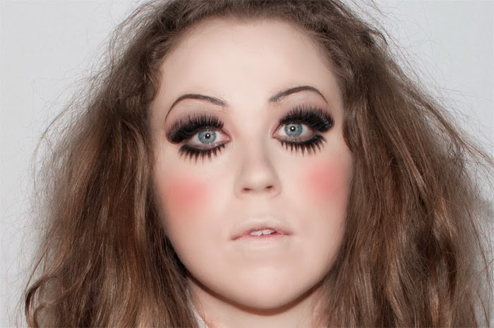 |
| High Pass layer set to Overlay. Eyes and teeth brightened with Levels adjustment layer. |
Next, the area around the eyebrows needed a little extra smoothing because this is where here actual eyebrows are and were still showing slightly. I gave them an extra round with the High Pass procedure to smooth out the texture, and also painted in more colour to thicken the eyebrows.
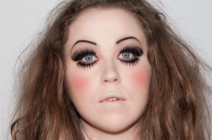 |
| Smoother skin over the eyes and darker eyebrows. |
As you can see, the fake eyelashes are set lower than the actual lashes. This makes the eyes bigger, but there is bit of unclear skin in between. I painted in a thin band of skin (with a Bevel and Emboss layer style to add the slight highlight to the lower eyelid) and of black to mimic the area where the eyelid meets the lashes.
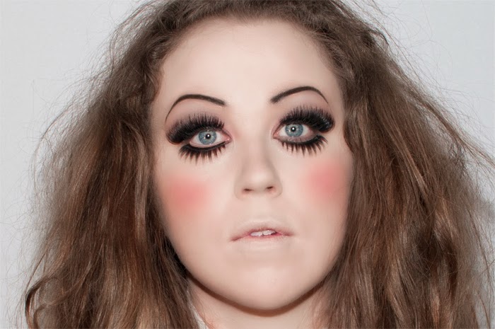 |
| Touch-up of eyelid and lashes (left) and original (right). |
Part of the desired look was a cracked appearance of the porcelain. I found a few images of rips and cracks in dried paint and an eggshell. These were put in place over the face and worked into the image by masking out the undesired parts of the images and setting the layer blending modes to Multiply, which makes pure white areas disappear and darkens other areas. Perfect for showing only the cracks in these white images. The cracked eggshell needed a bit more work because there is a lot of grey in it and the cracks are so faint. By adding two copies of it, one set to blending mode Linear Burn -- the other to Luminosity, the cracks became visible.
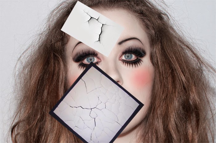 |
| Cracking the porcelain. |
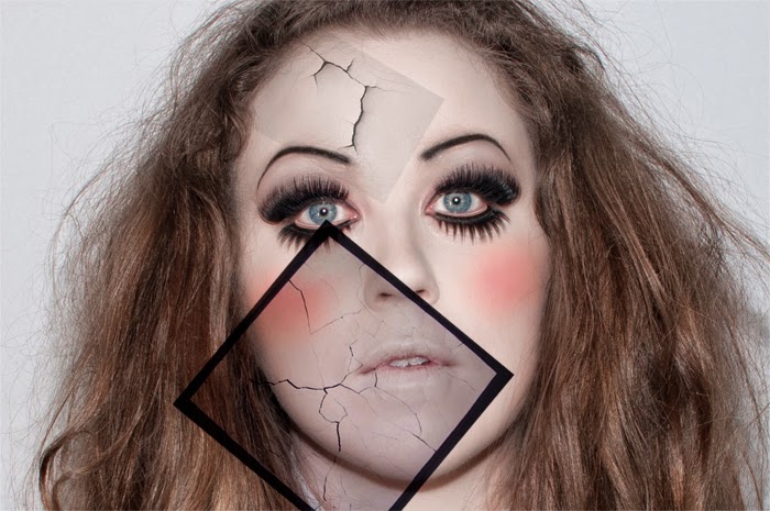 |
| Blending mode: Multiply. |
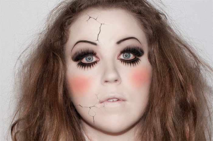 |
| Masking out the unwanted bits. |
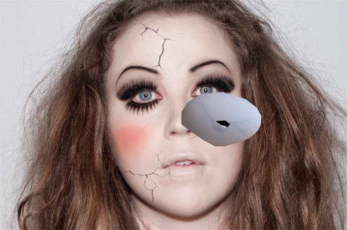 |
| You have to break a few eggs to make a bad pun. |
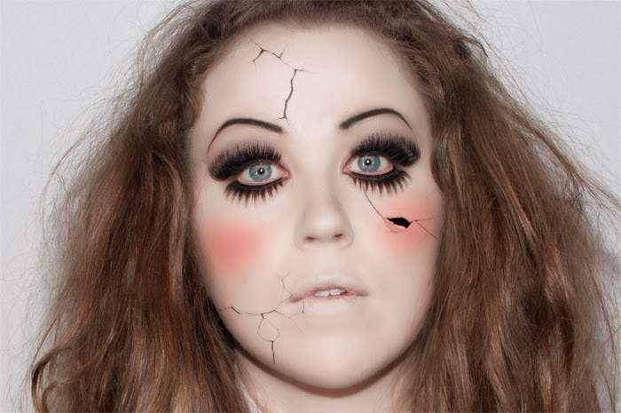 |
| Multiply and masking to add the cracked eggshell to the skin. |
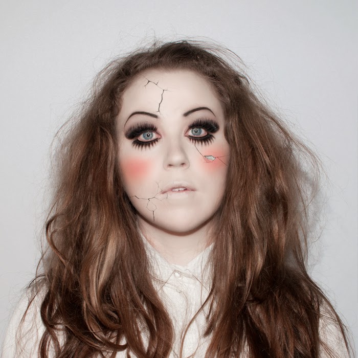 |
| A final piece of white added to the crack to simulate the painted surface flaking off before cropping to 1400x1400 px cover size. |
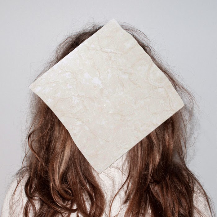
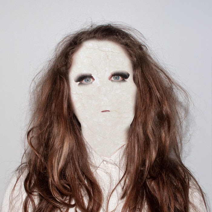
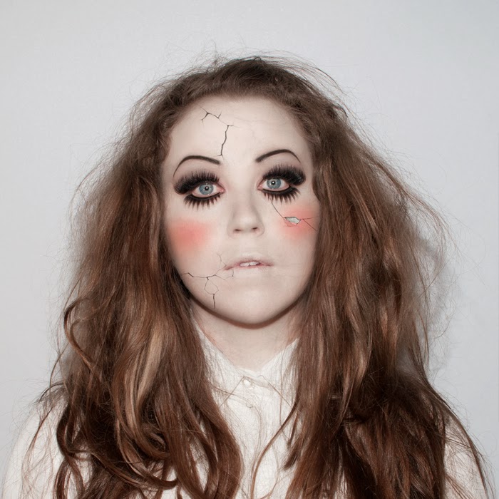
To add a little more of a distressed look to the skin, a marble texture was added. This made it look as if the porcelain was covered by a faint web of fine cracks. It was important to make these follow the contours of the face, so a Displacement Map was added. For this, a copy of one of the colour channels (Red, Green or Blue) with the most contrast is saved as a new document. Under Filter > Distort > Displace, this new document is added to whichever layer needs the distortion, in this case the marble tile. When this is set to Overlay blending mode, it makes the texture of the tile seem to follow the shape of the face.
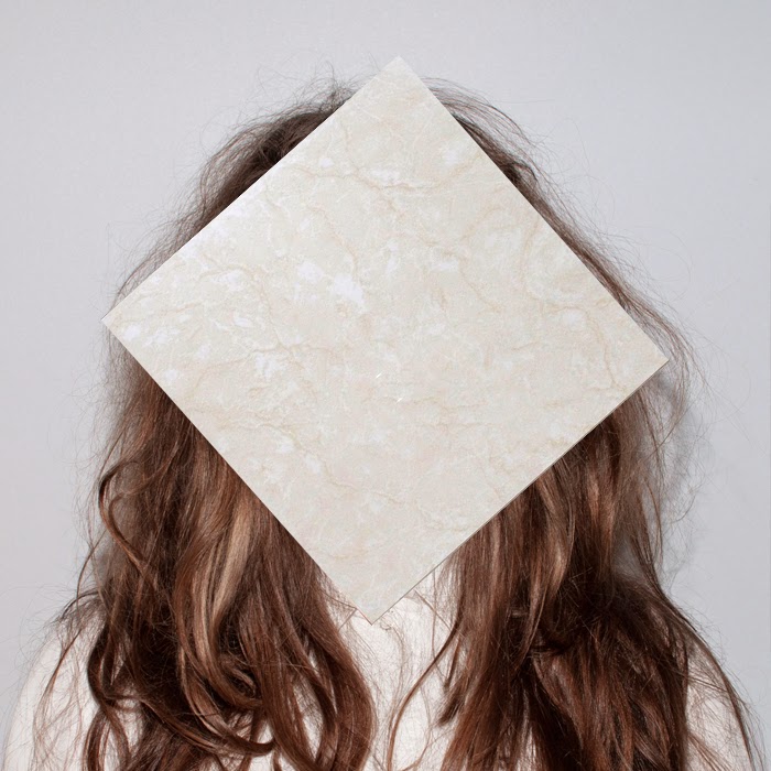 |
| The marble tile for texture. |
 |
| Ready-made displacement map. |
 |
| The tile after adding the displacement map. |
 |
| Masking out the bits of tile that fall outside of the face. |
 |
| Displacement map after blending in with Overlay. |
After that it was a matter of adding the band name and song title with a bit of shadow behind the words to make them stand out from the (mostly) white background. End result:


